KWD Brand Guidelines
Visual identity, design standards, and usage rules that define KWD — Kesararam With Digital.
v1.0 · Last updated June 2026 · Technovation Girls 2026 · Team #50777 · Siem Reap, Cambodia
Brand Name & Meaning
KWD stands for Kesararam With Digital — a name carrying the weight of place, purpose, and transformation. Kesararam is the name of the monastery and primary school — the oldest seat of learning in our community.
The word "With" declares a partnership between tradition and technology. "Digital" is a commitment to access, reach, and permanence.
KWD was created by young Cambodian women from Kesararam Primary School with the vision that road safety education should be free, interactive, and accessible in students' native language.
Recommendation: Use the full name "Kesararam With Digital" on first reference in press, presentations, and official documents. "KWD" may be used after.
Logo & Meaning
The lightning bolt on the KWD logo is not ornamental — it is the core philosophy of the brand. It represents Flash Learning: in the age of AI, knowledge must move at the speed of light.
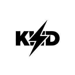
kwd-black_nobackground.png
Black (default)
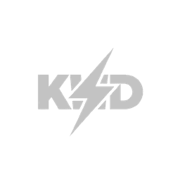
kwd-gray.png
Gray
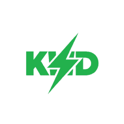
kwd-green.png
Green
kwd-black_nobackground.png (inverted)
White (on dark)
Usage Rules
- —Do not stretch, rotate, or distort the logo.
- —Do not apply shadows, gradients, or filters.
- —Do not place the logo on low-contrast backgrounds.
- —Maintain clear space equal to the height of the 'K'.
- —Use the black logo on light backgrounds only.
- —Minimum height: 24 px in any digital context.
- —Do not recolor or add outlines to the logo.
Color Palette
Typography
Display · 36px · Black
KWD
Heading · 20px · Bold
Brand Guidelines
Body · 14px · Regular
Education should be free, interactive, and accessible.
Design DNA — Brutalist
Design Kit — Shapes, Tape & Icons
Reusable road-sign shapes and caution-tape patterns. All pure vector (SVG) — they stay crisp at any size, from a 16px icon to a 4K slide. Flat brutalist: solid black border, no shadow, no gradients, no neon. Khmer labels set in Siemreap / Google Sans.
Shapes
Diamond
Warning
shape="diamond"Octagon
Stop
shape="octagon"Circle
Prohibitory
shape="circle"Sign
Information
shape="sign"Triangle
Caution
shape="triangle"Banner
Guide
shape="banner"Caution Tape
Caution
variant="caution"Chevron
variant="chevron"Checker
variant="checker"Dashed
variant="dashed"Line
variant="line"import { CautionTape, SignShape } from "@/components/brand/brand-kit"
Applications & Mockups

Mockup 1
Tote & Stationery

Mockup 2
Educational Toys & Cards

Mockup 3
Mug & Bottle

Mockup 4
Brand Apparel

Mockup 5
Web & Desktop App

Mockup 6
Corporate Stationery
Site Architecture
Explore the full public page structure in the interactive HUD-style sitemap.
View Sitemap